Podcast Highlight: Vijay Mallya Podcast: Rise & Downfall Of Kingfisher Airlines, Loans & RCB – FO364 (Raj Shamani)

Overview

In a rare and highly anticipated appearance, Vijay Mallya—once celebrated as the flamboyant “King of Good Times”—returned to the public eye on Raj Shamani’s podcast, Figuring Out. In this 4-hour episode, Mallya speaks at length about his rise, the dramatic fall of Kingfisher Airlines, massive loan defaults, and the fate of his IPL team, Royal Challengers Bangalore.(The Times of India, Indiatimes, Wikipedia)

Key Moments & Insights

  • Loneliest Day Reflects Neglected Life: When asked about his loneliest day in the past nine years, Mallya paused, sighed, and admitted, “The frenzy of the past doesn’t last forever,” describing his current life as one of “semi-retirement.”(The Times of India, Indiatimes)

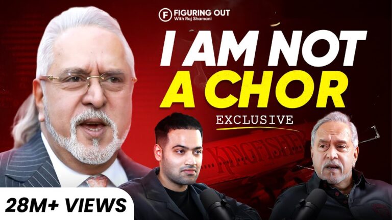
  • “Fugitive” vs. “Chor” Debate: Mallya accepted the label of a fugitive—he left India in 2016—but vehemently rejected being branded a “chor” (thief), challenging where the accusation of theft originates.(Indiatimes, Wikipedia)

  • Apology That Missed the Tone: When asked to address Kingfisher employees who were affected financially, Mallya expressed being “sad,” but notably did not apologize—saying, “What I apologize for?” instead. This phrasing sparked a wave of criticism online.(Reddit, Indiatimes)

  • Viral Reach & Impact: The podcast quickly went viral—amassing over 20 million views on YouTube within just four days—prompting lively discussions and comedic takes, including a spoof by comedian Shubham Gaur.(The Times of India)

  • Return to India?: Mallya said he might consider returning if assured of a fair trial and humane treatment in custody, referencing UK court rulings that criticized detention conditions in India.(Indiatimes, Wikipedia)

  • How the Podcast Came to Be: Raj Shamani revealed that the opportunity arose unexpectedly—on a walk in London he happened upon Mallya and boldly approached him, later leading to this notable interview.(The Economic Times, Wikipedia)


Public Reactions & Commentary

On Reddit, a younger viewer candidly shared:

“He said he was ‘sad’ about what happened to them [employees] but ‘not sorry,’ because it wasn’t entirely his fault. … That rubbed me the wrong way.”(Reddit)

Meanwhile, Think-pieces called the podcast a meticulously crafted image management effort, noting Mallya’s claim of misfortune and timing rather than accepting full responsibility.(The Times of India)


Context: Who Are These Voices?

  • Vijay Mallya: Previously a powerful industrialist in India, Mallya led United Breweries and United Spirits, founded Kingfisher Airlines, and co-owned RCB in the IPL. Currently, he remains in the UK while facing extradition and legal battles over defaulted loans and fraud allegations.(Wikipedia)

  • Raj Shamani: A 27-year-old content creator from Indore, Shamani runs Figuring Out, one of India’s leading leadership podcasts. Known for securing high-profile guests—like Bill Gates, Aamir Khan, and now Vijay Mallya—Shamani’s bold and determined approach has made him a recognized voice in digital media.(The Times of India, Wikipedia)


Final Thoughts

This episode wasn’t just a media moment—it was a sensational comeback, blending personal revelation, legal controversy, and media strategy. Mallya presented a defense punctuated by self-reflection, yet shrouded in deflection. His tone left many unconvinced, even as the podcast’s runaway view count proved his knack for public intrigue remains strong.

Would you like me to add a transcript summary, quotes from the exchange, or a breakdown of different segments from the 4-hour podcast? Let me know—I can also help craft interview-style blog copy or social media snippets.

360 degree podcast post

Lorem ipsum dolor, sit amet consectetur adipisicing elit. Iure vel officiis ipsum placeat itaque neque dolorem modi perspiciatis dolor distinctio veritatis sapiente, minima corrupti dolores necessitatibus suscipit accusantium dignissimos culpa cumque.

Ea nemo et dolorum quidem non est aut. Tempore delectus dolorum delectus omnis velit quia. Nobis eius atque occaeca

It is a long established fact that a reader will be distracted by the readable content of a page when looking at its layout. The point of using Lorem Ipsum is that it has a more-or-less normal distribution of letters.

  1. We want everything to look good out of the box.
  2. Really just the first reason, that’s the whole point of the plugin.
  3. Here’s a third pretend reason though a list with three items looks more realistic than a list with two items.

Typography should be easy

So that’s a header for you — with any luck if we’ve done our job correctly that will look pretty reasonable.

Something a wise person once told me about typography is:

Typography is pretty important if you don’t want your stuff to look like trash. Make it good then it won’t be bad.

It’s probably important that images look okay here by default as well:

What to expect from here on out

What follows from here is just a bunch of absolute nonsense I’ve written to dogfood the plugin itself. It includes every sensible typographic element I could think of, like bold text, unordered lists, ordered lists, code blocks, block quotes, and even italics.

It’s important to cover all of these use cases for a few reasons:

  1. We want everything to look good out of the box.
  2. Really just the first reason, that’s the whole point of the plugin.
  3. Here’s a third pretend reason though a list with three items looks more realistic than a list with two items.

Now we’re going to try out another header style.

Lorem ipsum dolor, sit amet consectetur adipisicing elit. Iure vel officiis ipsum placeat itaque neque dolorem modi perspiciatis dolor distinctio veritatis sapiente

Now I’m going to show you an example of an unordered list to make sure that looks good, too:

  • So here is the first item in this list.
  • In this example we’re keeping the items short.
  • Later, we’ll use longer, more complex list items.

And that’s the end of this section.

Code should look okay by default.

I think most people are going to use highlight.js or Prism or something if they want to style their code blocks but it wouldn’t hurt to make them look okay out of the box, even with no syntax highlighting.

What I’ve written here is probably long enough, but adding this final sentence can’t hurt.

function tick() {
  const element = (
    <div>
      <h1>Hello, world!</h1>
      <h2>It is {new Date().toLocaleTimeString()}.</h2>
    </div>
  );
  ReactDOM.render(element, document.getElementById('root'));
} 

Hopefully that looks good enough to you.

There are other elements we need to style

I almost forgot to mention links, like this link to the Tailwind CSS website. We almost made them blue but that’s so yesterday, so we went with dark gray, feels edgier.

We even included table styles, check it out:

WrestlerOriginFinisher
Bret “The Hitman” HartCalgary, ABSharpshooter
Stone Cold Steve AustinAustin, TXStone Cold Stunner
Randy SavageSarasota, FLElbow Drop
VaderBoulder, COVader Bomb
Razor RamonChuluota, FLRazor’s Edge

We also need to make sure inline code looks good, like if I wanted to talk about <span> elements or tell you the good news about @tailwindcss/typography.

We still need to think about stacked headings though.

Ea nemo et dolorum quidem non est aut. Tempore delectus dolorum delectus omnis velit quia. Nobis eius atque occaeca

Let’s make sure we don’t screw that up h4 elements, either.

Phew, with any luck we have styled the headings above this text and they look pretty good.

Ea nemo et dolorum quidem non est aut. Tempore delectus dolorum delectus omnis velit quia. Nobis eius atque occaeca

Let’s add a closing paragraph here so things end with a decently sized block of text. I can’t explain why I want things to end that way but I have to assume it’s because I think things will look weird or unbalanced if there is a heading too close to the end of the document.

Mind games: How play

Lorem ipsum dolor, sit amet consectetur adipisicing elit. Iure vel officiis ipsum placeat itaque neque dolorem modi perspiciatis dolor distinctio veritatis sapiente, minima corrupti dolores necessitatibus suscipit accusantium dignissimos culpa cumque.

Ea nemo et dolorum quidem non est aut. Tempore delectus dolorum delectus omnis velit quia. Nobis eius atque occaeca

It is a long established fact that a reader will be distracted by the readable content of a page when looking at its layout. The point of using Lorem Ipsum is that it has a more-or-less normal distribution of letters.

  1. We want everything to look good out of the box.
  2. Really just the first reason, that’s the whole point of the plugin.
  3. Here’s a third pretend reason though a list with three items looks more realistic than a list with two items.

Typography should be easy

So that’s a header for you — with any luck if we’ve done our job correctly that will look pretty reasonable.

Something a wise person once told me about typography is:

Typography is pretty important if you don’t want your stuff to look like trash. Make it good then it won’t be bad.

It’s probably important that images look okay here by default as well:

What to expect from here on out

What follows from here is just a bunch of absolute nonsense I’ve written to dogfood the plugin itself. It includes every sensible typographic element I could think of, like bold text, unordered lists, ordered lists, code blocks, block quotes, and even italics.

It’s important to cover all of these use cases for a few reasons:

  1. We want everything to look good out of the box.
  2. Really just the first reason, that’s the whole point of the plugin.
  3. Here’s a third pretend reason though a list with three items looks more realistic than a list with two items.

Now we’re going to try out another header style.

Lorem ipsum dolor, sit amet consectetur adipisicing elit. Iure vel officiis ipsum placeat itaque neque dolorem modi perspiciatis dolor distinctio veritatis sapiente

Now I’m going to show you an example of an unordered list to make sure that looks good, too:

  • So here is the first item in this list.
  • In this example we’re keeping the items short.
  • Later, we’ll use longer, more complex list items.

And that’s the end of this section.

Code should look okay by default.

I think most people are going to use highlight.js or Prism or something if they want to style their code blocks but it wouldn’t hurt to make them look okay out of the box, even with no syntax highlighting.

What I’ve written here is probably long enough, but adding this final sentence can’t hurt.

function tick() {
  const element = (
    <div>
      <h1>Hello, world!</h1>
      <h2>It is {new Date().toLocaleTimeString()}.</h2>
    </div>
  );
  ReactDOM.render(element, document.getElementById('root'));
} 

Hopefully that looks good enough to you.

There are other elements we need to style

I almost forgot to mention links, like this link to the Tailwind CSS website. We almost made them blue but that’s so yesterday, so we went with dark gray, feels edgier.

We even included table styles, check it out:

WrestlerOriginFinisher
Bret “The Hitman” HartCalgary, ABSharpshooter
Stone Cold Steve AustinAustin, TXStone Cold Stunner
Randy SavageSarasota, FLElbow Drop
VaderBoulder, COVader Bomb
Razor RamonChuluota, FLRazor’s Edge

We also need to make sure inline code looks good, like if I wanted to talk about <span> elements or tell you the good news about @tailwindcss/typography.

We still need to think about stacked headings though.

Ea nemo et dolorum quidem non est aut. Tempore delectus dolorum delectus omnis velit quia. Nobis eius atque occaeca

Let’s make sure we don’t screw that up h4 elements, either.

Phew, with any luck we have styled the headings above this text and they look pretty good.

Ea nemo et dolorum quidem non est aut. Tempore delectus dolorum delectus omnis velit quia. Nobis eius atque occaeca

Let’s add a closing paragraph here so things end with a decently sized block of text. I can’t explain why I want things to end that way but I have to assume it’s because I think things will look weird or unbalanced if there is a heading too close to the end of the document.

How architects visualize

Lorem ipsum dolor, sit amet consectetur adipisicing elit. Iure vel officiis ipsum placeat itaque neque dolorem modi perspiciatis dolor distinctio veritatis sapiente, minima corrupti dolores necessitatibus suscipit accusantium dignissimos culpa cumque.

Ea nemo et dolorum quidem non est aut. Tempore delectus dolorum delectus omnis velit quia. Nobis eius atque occaeca

It is a long established fact that a reader will be distracted by the readable content of a page when looking at its layout. The point of using Lorem Ipsum is that it has a more-or-less normal distribution of letters.

  1. We want everything to look good out of the box.
  2. Really just the first reason, that’s the whole point of the plugin.
  3. Here’s a third pretend reason though a list with three items looks more realistic than a list with two items.

Typography should be easy

So that’s a header for you — with any luck if we’ve done our job correctly that will look pretty reasonable.

Something a wise person once told me about typography is:

Typography is pretty important if you don’t want your stuff to look like trash. Make it good then it won’t be bad.

It’s probably important that images look okay here by default as well:

What to expect from here on out

What follows from here is just a bunch of absolute nonsense I’ve written to dogfood the plugin itself. It includes every sensible typographic element I could think of, like bold text, unordered lists, ordered lists, code blocks, block quotes, and even italics.

It’s important to cover all of these use cases for a few reasons:

  1. We want everything to look good out of the box.
  2. Really just the first reason, that’s the whole point of the plugin.
  3. Here’s a third pretend reason though a list with three items looks more realistic than a list with two items.

Now we’re going to try out another header style.

Lorem ipsum dolor, sit amet consectetur adipisicing elit. Iure vel officiis ipsum placeat itaque neque dolorem modi perspiciatis dolor distinctio veritatis sapiente

Now I’m going to show you an example of an unordered list to make sure that looks good, too:

  • So here is the first item in this list.
  • In this example we’re keeping the items short.
  • Later, we’ll use longer, more complex list items.

And that’s the end of this section.

Code should look okay by default.

I think most people are going to use highlight.js or Prism or something if they want to style their code blocks but it wouldn’t hurt to make them look okay out of the box, even with no syntax highlighting.

What I’ve written here is probably long enough, but adding this final sentence can’t hurt.

function tick() {
  const element = (
    <div>
      <h1>Hello, world!</h1>
      <h2>It is {new Date().toLocaleTimeString()}.</h2>
    </div>
  );
  ReactDOM.render(element, document.getElementById('root'));
} 

Hopefully that looks good enough to you.

There are other elements we need to style

I almost forgot to mention links, like this link to the Tailwind CSS website. We almost made them blue but that’s so yesterday, so we went with dark gray, feels edgier.

We even included table styles, check it out:

WrestlerOriginFinisher
Bret “The Hitman” HartCalgary, ABSharpshooter
Stone Cold Steve AustinAustin, TXStone Cold Stunner
Randy SavageSarasota, FLElbow Drop
VaderBoulder, COVader Bomb
Razor RamonChuluota, FLRazor’s Edge

We also need to make sure inline code looks good, like if I wanted to talk about <span> elements or tell you the good news about @tailwindcss/typography.

We still need to think about stacked headings though.

Ea nemo et dolorum quidem non est aut. Tempore delectus dolorum delectus omnis velit quia. Nobis eius atque occaeca

Let’s make sure we don’t screw that up h4 elements, either.

Phew, with any luck we have styled the headings above this text and they look pretty good.

Ea nemo et dolorum quidem non est aut. Tempore delectus dolorum delectus omnis velit quia. Nobis eius atque occaeca

Let’s add a closing paragraph here so things end with a decently sized block of text. I can’t explain why I want things to end that way but I have to assume it’s because I think things will look weird or unbalanced if there is a heading too close to the end of the document.

New tools for Black

Lorem ipsum dolor, sit amet consectetur adipisicing elit. Iure vel officiis ipsum placeat itaque neque dolorem modi perspiciatis dolor distinctio veritatis sapiente, minima corrupti dolores necessitatibus suscipit accusantium dignissimos culpa cumque.

Ea nemo et dolorum quidem non est aut. Tempore delectus dolorum delectus omnis velit quia. Nobis eius atque occaeca

It is a long established fact that a reader will be distracted by the readable content of a page when looking at its layout. The point of using Lorem Ipsum is that it has a more-or-less normal distribution of letters.

  1. We want everything to look good out of the box.
  2. Really just the first reason, that’s the whole point of the plugin.
  3. Here’s a third pretend reason though a list with three items looks more realistic than a list with two items.

Typography should be easy

So that’s a header for you — with any luck if we’ve done our job correctly that will look pretty reasonable.

Something a wise person once told me about typography is:

Typography is pretty important if you don’t want your stuff to look like trash. Make it good then it won’t be bad.

It’s probably important that images look okay here by default as well:

What to expect from here on out

What follows from here is just a bunch of absolute nonsense I’ve written to dogfood the plugin itself. It includes every sensible typographic element I could think of, like bold text, unordered lists, ordered lists, code blocks, block quotes, and even italics.

It’s important to cover all of these use cases for a few reasons:

  1. We want everything to look good out of the box.
  2. Really just the first reason, that’s the whole point of the plugin.
  3. Here’s a third pretend reason though a list with three items looks more realistic than a list with two items.

Now we’re going to try out another header style.

Lorem ipsum dolor, sit amet consectetur adipisicing elit. Iure vel officiis ipsum placeat itaque neque dolorem modi perspiciatis dolor distinctio veritatis sapiente

Now I’m going to show you an example of an unordered list to make sure that looks good, too:

  • So here is the first item in this list.
  • In this example we’re keeping the items short.
  • Later, we’ll use longer, more complex list items.

And that’s the end of this section.

Code should look okay by default.

I think most people are going to use highlight.js or Prism or something if they want to style their code blocks but it wouldn’t hurt to make them look okay out of the box, even with no syntax highlighting.

What I’ve written here is probably long enough, but adding this final sentence can’t hurt.

function tick() {
  const element = (
    <div>
      <h1>Hello, world!</h1>
      <h2>It is {new Date().toLocaleTimeString()}.</h2>
    </div>
  );
  ReactDOM.render(element, document.getElementById('root'));
} 

Hopefully that looks good enough to you.

There are other elements we need to style

I almost forgot to mention links, like this link to the Tailwind CSS website. We almost made them blue but that’s so yesterday, so we went with dark gray, feels edgier.

We even included table styles, check it out:

WrestlerOriginFinisher
Bret “The Hitman” HartCalgary, ABSharpshooter
Stone Cold Steve AustinAustin, TXStone Cold Stunner
Randy SavageSarasota, FLElbow Drop
VaderBoulder, COVader Bomb
Razor RamonChuluota, FLRazor’s Edge

We also need to make sure inline code looks good, like if I wanted to talk about <span> elements or tell you the good news about @tailwindcss/typography.

We still need to think about stacked headings though.

Ea nemo et dolorum quidem non est aut. Tempore delectus dolorum delectus omnis velit quia. Nobis eius atque occaeca

Let’s make sure we don’t screw that up h4 elements, either.

Phew, with any luck we have styled the headings above this text and they look pretty good.

Ea nemo et dolorum quidem non est aut. Tempore delectus dolorum delectus omnis velit quia. Nobis eius atque occaeca

Let’s add a closing paragraph here so things end with a decently sized block of text. I can’t explain why I want things to end that way but I have to assume it’s because I think things will look weird or unbalanced if there is a heading too close to the end of the document.

How AI and Teams

Lorem ipsum dolor, sit amet consectetur adipisicing elit. Iure vel officiis ipsum placeat itaque neque dolorem modi perspiciatis dolor distinctio veritatis sapiente, minima corrupti dolores necessitatibus suscipit accusantium dignissimos culpa cumque.

Ea nemo et dolorum quidem non est aut. Tempore delectus dolorum delectus omnis velit quia. Nobis eius atque occaeca

It is a long established fact that a reader will be distracted by the readable content of a page when looking at its layout. The point of using Lorem Ipsum is that it has a more-or-less normal distribution of letters.

  1. We want everything to look good out of the box.
  2. Really just the first reason, that’s the whole point of the plugin.
  3. Here’s a third pretend reason though a list with three items looks more realistic than a list with two items.

Typography should be easy

So that’s a header for you — with any luck if we’ve done our job correctly that will look pretty reasonable.

Something a wise person once told me about typography is:

Typography is pretty important if you don’t want your stuff to look like trash. Make it good then it won’t be bad.

It’s probably important that images look okay here by default as well:

What to expect from here on out

What follows from here is just a bunch of absolute nonsense I’ve written to dogfood the plugin itself. It includes every sensible typographic element I could think of, like bold text, unordered lists, ordered lists, code blocks, block quotes, and even italics.

It’s important to cover all of these use cases for a few reasons:

  1. We want everything to look good out of the box.
  2. Really just the first reason, that’s the whole point of the plugin.
  3. Here’s a third pretend reason though a list with three items looks more realistic than a list with two items.

Now we’re going to try out another header style.

Lorem ipsum dolor, sit amet consectetur adipisicing elit. Iure vel officiis ipsum placeat itaque neque dolorem modi perspiciatis dolor distinctio veritatis sapiente

Now I’m going to show you an example of an unordered list to make sure that looks good, too:

  • So here is the first item in this list.
  • In this example we’re keeping the items short.
  • Later, we’ll use longer, more complex list items.

And that’s the end of this section.

Code should look okay by default.

I think most people are going to use highlight.js or Prism or something if they want to style their code blocks but it wouldn’t hurt to make them look okay out of the box, even with no syntax highlighting.

What I’ve written here is probably long enough, but adding this final sentence can’t hurt.

function tick() {
  const element = (
    <div>
      <h1>Hello, world!</h1>
      <h2>It is {new Date().toLocaleTimeString()}.</h2>
    </div>
  );
  ReactDOM.render(element, document.getElementById('root'));
} 

Hopefully that looks good enough to you.

There are other elements we need to style

I almost forgot to mention links, like this link to the Tailwind CSS website. We almost made them blue but that’s so yesterday, so we went with dark gray, feels edgier.

We even included table styles, check it out:

WrestlerOriginFinisher
Bret “The Hitman” HartCalgary, ABSharpshooter
Stone Cold Steve AustinAustin, TXStone Cold Stunner
Randy SavageSarasota, FLElbow Drop
VaderBoulder, COVader Bomb
Razor RamonChuluota, FLRazor’s Edge

We also need to make sure inline code looks good, like if I wanted to talk about <span> elements or tell you the good news about @tailwindcss/typography.

We still need to think about stacked headings though.

Ea nemo et dolorum quidem non est aut. Tempore delectus dolorum delectus omnis velit quia. Nobis eius atque occaeca

Let’s make sure we don’t screw that up h4 elements, either.

Phew, with any luck we have styled the headings above this text and they look pretty good.

Ea nemo et dolorum quidem non est aut. Tempore delectus dolorum delectus omnis velit quia. Nobis eius atque occaeca

Let’s add a closing paragraph here so things end with a decently sized block of text. I can’t explain why I want things to end that way but I have to assume it’s because I think things will look weird or unbalanced if there is a heading too close to the end of the document.

New tools and advocacy support Black pregnant and postpartum mothers to save lives

Lorem ipsum dolor, sit amet consectetur adipisicing elit. Iure vel officiis ipsum placeat itaque neque dolorem modi perspiciatis dolor distinctio veritatis sapiente, minima corrupti dolores necessitatibus suscipit accusantium dignissimos culpa cumque.

Ea nemo et dolorum quidem non est aut. Tempore delectus dolorum delectus omnis velit quia. Nobis eius atque occaeca

It is a long established fact that a reader will be distracted by the readable content of a page when looking at its layout. The point of using Lorem Ipsum is that it has a more-or-less normal distribution of letters.

  1. We want everything to look good out of the box.
  2. Really just the first reason, that’s the whole point of the plugin.
  3. Here’s a third pretend reason though a list with three items looks more realistic than a list with two items.

Typography should be easy

So that’s a header for you — with any luck if we’ve done our job correctly that will look pretty reasonable.

Something a wise person once told me about typography is:

Typography is pretty important if you don’t want your stuff to look like trash. Make it good then it won’t be bad.

It’s probably important that images look okay here by default as well:

What to expect from here on out

What follows from here is just a bunch of absolute nonsense I’ve written to dogfood the plugin itself. It includes every sensible typographic element I could think of, like bold text, unordered lists, ordered lists, code blocks, block quotes, and even italics.

It’s important to cover all of these use cases for a few reasons:

  1. We want everything to look good out of the box.
  2. Really just the first reason, that’s the whole point of the plugin.
  3. Here’s a third pretend reason though a list with three items looks more realistic than a list with two items.

Now we’re going to try out another header style.

Lorem ipsum dolor, sit amet consectetur adipisicing elit. Iure vel officiis ipsum placeat itaque neque dolorem modi perspiciatis dolor distinctio veritatis sapiente

Now I’m going to show you an example of an unordered list to make sure that looks good, too:

  • So here is the first item in this list.
  • In this example we’re keeping the items short.
  • Later, we’ll use longer, more complex list items.

And that’s the end of this section.

Code should look okay by default.

I think most people are going to use highlight.js or Prism or something if they want to style their code blocks but it wouldn’t hurt to make them look okay out of the box, even with no syntax highlighting.

What I’ve written here is probably long enough, but adding this final sentence can’t hurt.

function tick() {
  const element = (
    <div>
      <h1>Hello, world!</h1>
      <h2>It is {new Date().toLocaleTimeString()}.</h2>
    </div>
  );
  ReactDOM.render(element, document.getElementById('root'));
} 

Hopefully that looks good enough to you.

There are other elements we need to style

I almost forgot to mention links, like this link to the Tailwind CSS website. We almost made them blue but that’s so yesterday, so we went with dark gray, feels edgier.

We even included table styles, check it out:

WrestlerOriginFinisher
Bret “The Hitman” HartCalgary, ABSharpshooter
Stone Cold Steve AustinAustin, TXStone Cold Stunner
Randy SavageSarasota, FLElbow Drop
VaderBoulder, COVader Bomb
Razor RamonChuluota, FLRazor’s Edge

We also need to make sure inline code looks good, like if I wanted to talk about <span> elements or tell you the good news about @tailwindcss/typography.

We still need to think about stacked headings though.

Ea nemo et dolorum quidem non est aut. Tempore delectus dolorum delectus omnis velit quia. Nobis eius atque occaeca

Let’s make sure we don’t screw that up h4 elements, either.

Phew, with any luck we have styled the headings above this text and they look pretty good.

Ea nemo et dolorum quidem non est aut. Tempore delectus dolorum delectus omnis velit quia. Nobis eius atque occaeca

Let’s add a closing paragraph here so things end with a decently sized block of text. I can’t explain why I want things to end that way but I have to assume it’s because I think things will look weird or unbalanced if there is a heading too close to the end of the document.

Unusual ‘machine in the woods’ taps clean energy deep underground for new Microsoft campus

Lorem ipsum dolor, sit amet consectetur adipisicing elit. Iure vel officiis ipsum placeat itaque neque dolorem modi perspiciatis dolor distinctio veritatis sapiente, minima corrupti dolores necessitatibus suscipit accusantium dignissimos culpa cumque.

Ea nemo et dolorum quidem non est aut. Tempore delectus dolorum delectus omnis velit quia. Nobis eius atque occaeca

It is a long established fact that a reader will be distracted by the readable content of a page when looking at its layout. The point of using Lorem Ipsum is that it has a more-or-less normal distribution of letters.

  1. We want everything to look good out of the box.
  2. Really just the first reason, that’s the whole point of the plugin.
  3. Here’s a third pretend reason though a list with three items looks more realistic than a list with two items.

Typography should be easy

So that’s a header for you — with any luck if we’ve done our job correctly that will look pretty reasonable.

Something a wise person once told me about typography is:

Typography is pretty important if you don’t want your stuff to look like trash. Make it good then it won’t be bad.

It’s probably important that images look okay here by default as well:

What to expect from here on out

What follows from here is just a bunch of absolute nonsense I’ve written to dogfood the plugin itself. It includes every sensible typographic element I could think of, like bold text, unordered lists, ordered lists, code blocks, block quotes, and even italics.

It’s important to cover all of these use cases for a few reasons:

  1. We want everything to look good out of the box.
  2. Really just the first reason, that’s the whole point of the plugin.
  3. Here’s a third pretend reason though a list with three items looks more realistic than a list with two items.

Now we’re going to try out another header style.

Lorem ipsum dolor, sit amet consectetur adipisicing elit. Iure vel officiis ipsum placeat itaque neque dolorem modi perspiciatis dolor distinctio veritatis sapiente

Now I’m going to show you an example of an unordered list to make sure that looks good, too:

  • So here is the first item in this list.
  • In this example we’re keeping the items short.
  • Later, we’ll use longer, more complex list items.

And that’s the end of this section.

Code should look okay by default.

I think most people are going to use highlight.js or Prism or something if they want to style their code blocks but it wouldn’t hurt to make them look okay out of the box, even with no syntax highlighting.

What I’ve written here is probably long enough, but adding this final sentence can’t hurt.

function tick() {
  const element = (
    <div>
      <h1>Hello, world!</h1>
      <h2>It is {new Date().toLocaleTimeString()}.</h2>
    </div>
  );
  ReactDOM.render(element, document.getElementById('root'));
} 

Hopefully that looks good enough to you.

There are other elements we need to style

I almost forgot to mention links, like this link to the Tailwind CSS website. We almost made them blue but that’s so yesterday, so we went with dark gray, feels edgier.

We even included table styles, check it out:

WrestlerOriginFinisher
Bret “The Hitman” HartCalgary, ABSharpshooter
Stone Cold Steve AustinAustin, TXStone Cold Stunner
Randy SavageSarasota, FLElbow Drop
VaderBoulder, COVader Bomb
Razor RamonChuluota, FLRazor’s Edge

We also need to make sure inline code looks good, like if I wanted to talk about <span> elements or tell you the good news about @tailwindcss/typography.

We still need to think about stacked headings though.

Ea nemo et dolorum quidem non est aut. Tempore delectus dolorum delectus omnis velit quia. Nobis eius atque occaeca

Let’s make sure we don’t screw that up h4 elements, either.

Phew, with any luck we have styled the headings above this text and they look pretty good.

Ea nemo et dolorum quidem non est aut. Tempore delectus dolorum delectus omnis velit quia. Nobis eius atque occaeca

Let’s add a closing paragraph here so things end with a decently sized block of text. I can’t explain why I want things to end that way but I have to assume it’s because I think things will look weird or unbalanced if there is a heading too close to the end of the document.

Mind games: How gaming can play a positive role in mental health

Lorem ipsum dolor, sit amet consectetur adipisicing elit. Iure vel officiis ipsum placeat itaque neque dolorem modi perspiciatis dolor distinctio veritatis sapiente, minima corrupti dolores necessitatibus suscipit accusantium dignissimos culpa cumque.

Ea nemo et dolorum quidem non est aut. Tempore delectus dolorum delectus omnis velit quia. Nobis eius atque occaeca

It is a long established fact that a reader will be distracted by the readable content of a page when looking at its layout. The point of using Lorem Ipsum is that it has a more-or-less normal distribution of letters.

  1. We want everything to look good out of the box.
  2. Really just the first reason, that’s the whole point of the plugin.
  3. Here’s a third pretend reason though a list with three items looks more realistic than a list with two items.

Typography should be easy

So that’s a header for you — with any luck if we’ve done our job correctly that will look pretty reasonable.

Something a wise person once told me about typography is:

Typography is pretty important if you don’t want your stuff to look like trash. Make it good then it won’t be bad.

It’s probably important that images look okay here by default as well:

What to expect from here on out

What follows from here is just a bunch of absolute nonsense I’ve written to dogfood the plugin itself. It includes every sensible typographic element I could think of, like bold text, unordered lists, ordered lists, code blocks, block quotes, and even italics.

It’s important to cover all of these use cases for a few reasons:

  1. We want everything to look good out of the box.
  2. Really just the first reason, that’s the whole point of the plugin.
  3. Here’s a third pretend reason though a list with three items looks more realistic than a list with two items.

Now we’re going to try out another header style.

Lorem ipsum dolor, sit amet consectetur adipisicing elit. Iure vel officiis ipsum placeat itaque neque dolorem modi perspiciatis dolor distinctio veritatis sapiente

Now I’m going to show you an example of an unordered list to make sure that looks good, too:

  • So here is the first item in this list.
  • In this example we’re keeping the items short.
  • Later, we’ll use longer, more complex list items.

And that’s the end of this section.

Code should look okay by default.

I think most people are going to use highlight.js or Prism or something if they want to style their code blocks but it wouldn’t hurt to make them look okay out of the box, even with no syntax highlighting.

What I’ve written here is probably long enough, but adding this final sentence can’t hurt.

function tick() {
  const element = (
    <div>
      <h1>Hello, world!</h1>
      <h2>It is {new Date().toLocaleTimeString()}.</h2>
    </div>
  );
  ReactDOM.render(element, document.getElementById('root'));
} 

Hopefully that looks good enough to you.

There are other elements we need to style

I almost forgot to mention links, like this link to the Tailwind CSS website. We almost made them blue but that’s so yesterday, so we went with dark gray, feels edgier.

We even included table styles, check it out:

WrestlerOriginFinisher
Bret “The Hitman” HartCalgary, ABSharpshooter
Stone Cold Steve AustinAustin, TXStone Cold Stunner
Randy SavageSarasota, FLElbow Drop
VaderBoulder, COVader Bomb
Razor RamonChuluota, FLRazor’s Edge

We also need to make sure inline code looks good, like if I wanted to talk about <span> elements or tell you the good news about @tailwindcss/typography.

We still need to think about stacked headings though.

Ea nemo et dolorum quidem non est aut. Tempore delectus dolorum delectus omnis velit quia. Nobis eius atque occaeca

Let’s make sure we don’t screw that up h4 elements, either.

Phew, with any luck we have styled the headings above this text and they look pretty good.

Ea nemo et dolorum quidem non est aut. Tempore delectus dolorum delectus omnis velit quia. Nobis eius atque occaeca

Let’s add a closing paragraph here so things end with a decently sized block of text. I can’t explain why I want things to end that way but I have to assume it’s because I think things will look weird or unbalanced if there is a heading too close to the end of the document.